

Step into a meeting room and—almost involuntarily—notice how the space feels. Something in the air? Not quite. Frequently, it’s the color that sets the rhythm before the conversation even begins. Walls aren’t just background décor; their hues can shape your alertness, mood, and willingness to speak up, though, admittedly, sometimes these effects sneak in so quietly you hardly realize what’s changed.
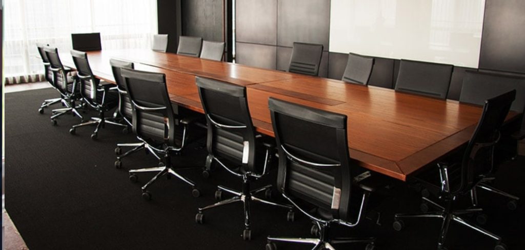
Picking the right color scheme isn’t as simple as browsing a few swatches and grabbing what looks trendy. There’s a subtle calculus at work, one that tries (but can’t always guarantee) to match the psychological patterns of your team members to the goals at hand: creativity, focus, or just the occasional bit of calm. Can that all come down to paint? Maybe not entirely, but it’s hard to dismiss the evidence that suggests an environment can gently coax certain habits into bloom. In this guide on how to choose meeting room colors, we’ll teach you how to do exactly that.
Why Color Matters in a Meeting Room?
Psychologists might say color helps orchestrate our internal weather—some shades quietly cool tempers, others provide a jolt that edges us toward new ideas. Walk into a blue room, and you may find the volume of anxiety dialed down. Converse in yellow or orange surrounds, and suddenly interruptions pick up in pace, ideas tumble out faster, sometimes recklessly so. To act as though color is just a matter of style seems to sidestep an opportunity, perhaps even a responsibility, for leaders hoping to tune the temperature of dialogue.
Of course, there’s more on display than cognitive science. The room—especially in a workplace—is a business card in architectural form. Visitors, be they recruits or seasoned clients, read between the lines of your color choices. Make the wrong pick and even the most generous observer might notice an airless, uncomfortable tension. Alternatively, a thoughtfully assembled palette implies intention, care, and a certain confidence, all before a word has been exchanged.
Understand the Purpose of the Room
No amount of clever color theory helps unless you’ve first stopped to ask: what are people actually doing in here? A space for number-crunching negotiations and one for loose brainstorming can’t possibly benefit from the same palette—unless, perhaps, you’re drawn to dissonance for its own sake (not usually the best plan in an office context). Rich grays or deep blues impart seriousness in decision-heavy settings; their gravity might be less welcome where light-hearted riffing is the goal.
Creative spaces, by contrast, sometimes benefit from heat—a touch of coral, maybe, or a soft orange, something warm enough to make standing up at the whiteboard feel slightly less daunting. Still, every so often, a meeting room must serve double duty. In these cases, I find that compromise is not the enemy, but beware: too much of it, and you’ll end up with beige, which is rarely anyone’s ideal.
7 Simple Step-by-step Guidelines on How to Choose Meeting Room Colors
Step 1: Determine the Primary Function of the Space
Start not with a color wheel but with a conversation. If marketing sees the room as its creative studio, and HR just wants a haven for confidential check-ins, there’s plenty to negotiate before you ever hit the paint store. You might discover, to your surprise, that a training space used for hour-long lectures demands far different sensibilities—a hue that soothes tired eyes, perhaps, or one that’s hard to resent after the third hour.

Clarity on these practicalities is essential and steers you away from the classic mistake: picking a gorgeous color that does real damage to energy and attention. For lounge-like meeting rooms, gravitate toward quieter, desaturated hues (think moss or linen, not construction-vest yellow). Pitch rooms, though, carry bolder colors perhaps more comfortably.
Step 2: Evaluate the Natural Lighting Conditions
It’s remarkable how paint twists and shifts in changing light. There’s almost no point in judging color on paper—especially not under the harsh neon glare of a store, a fact most of us discover only after regretting a gallon’s worth of the wrong shade. South-facing windows can handle moodier blues. They’ll gleam in the sun and avoid brooding. But windowless spaces are another matter entirely, sometimes capable of turning a stylish navy into something close to a submarine interior.
Here, it’s not about “making do” with what you have. The absence of natural light can be offset by judicious use of crisp, light-reflecting paint—off-whites, maybe a cheerful cream, or a gray so pale it slips into silver at midday. If artificial fixtures do the heavy lifting, colors should lean bright and clear rather than heavy and enclosing.
Step 3: Choose a Dominant Base Color
There’s a temptation to play it safe—many settle for greige or some cousin thereof—but the function of the dominant wall color goes beyond neutrality. The real trick is choosing a base that recedes just enough to frame conversation but never so much that the room feels unfinished. Reliable options exist: a soft, grounded gray, or an indisputably quiet blue, but even these need to be seen in the wider frame—the floor, ceiling, and trims shouldn’t wobble against the walls.
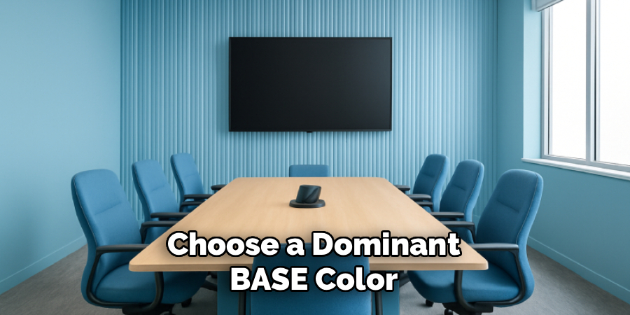
This is more flexible than you may expect. A stable base gives you permission to experiment later, swapping throws or chairs or, if you’re feeling daring, the old conference table itself. You won’t need to reach for the roller again every season if you’ve chosen wisely.
Step 4: Incorporate Brand Identity Wisely
Corporate culture rears its head even in the paint aisle. Still, turning the entire room into a three-dimensional slogan rarely ends well. It is often more effective—if you value your team’s sanity—to use aggressive brand tones as an accent or in smaller hits: perhaps the edge of a bookshelf, not the wall at your back during a long Zoom call.
Should your brand colors be truly striking, another approach is to trick the eye with pastel interpretations, maintaining some visual connection to the logo without holding everyone hostage to neon. There’s a delicate balance here: consistency without claustrophobia.
Step 5: Add Accent Colors for Visual Interest
A monotone room, in my experience, saps attention. The solution isn’t to throw paint wildly but to select a few accents—a wall behind the screen, a splash on the seats, or the artwork chosen not just for content, but for coordination. An accent color, properly used, becomes the anchor of the room, not a distraction.

Gray on gray, leavened by a hit of sunflower or emerald, transforms what might have been a staid government office into something that feels intentional, even a little sophisticated. The brain, it turns out, does better in spaces with a bit of punctuation.
Step 6: Consider the Psychological Impact of Shades
All colors tug at us, but rarely in the same direction or with equal force. The lore says blue calms; there’s research that appears to support this, but context is everything. A saturated blue can just as easily feel cold and distant. Green often connotes stability—a little oasis if negotiations run hot—, but some find it too restful, even soporific.
Red is not for the faint-hearted, which might be its only predictable quality. On occasion, a single streak of red will energize a brainstorming wall, but too much, and patience wears thin. Yellow intrigues: it beckons optimism but, in its more fluorescent guises, can become tiresome. In short, no shade guarantees a particular effect, but you can nudge the mood if you’re mindful.
Step 7: Balance the Room with Neutral Tones
Striking the right chord between stimulation and rest is really an act of moderation. If you’ve layered in bold accents and lively artwork, don’t forget to offer the eye a place to land. Neutral tones—charcoal table legs, pale floors, cream window treatments—act as counterweights.
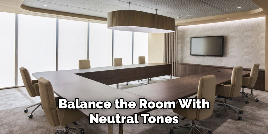
This equilibrium doesn’t require a mathematical formula, though designers may bluff otherwise. An inviting blue-green wall earns its keep when offset by beige upholstery and minimal clutter. The end result, ideally, feels both professional and somewhere you might actually want to finish a meeting.
Following these steps on how to choose meeting room colors will not only enhance the aesthetic appeal of your space but also create an environment that promotes productivity and encourages collaboration.
Common Mistakes to Avoid
There’s no shortage of ways to err. Neon splashes inspired by momentary trends can haunt you for years. Occasionally, someone ignores the ceiling, which, when left glaring white above moody walls, gives the impression of a too-snug shoebox. Or perhaps flooring is an afterthought, resulting in undertones that seem, at best, indifferent to the walls.
My own rule of thumb: assess the room with all elements in mind. Stand in the doorway, squint a little, and ask whether anything jars. If so, it probably will in a month, too.
Testing Before Final Decision
Paint chips lie. They are simply too small and taken too far out of context to provide any sense of scale or effect. A wiser approach? Test in broad strokes—literally. Swatch sizeable squares on several walls and watch what unfolds through sunlight, then again under artificial glare when evening falls.
Sleep on it. Notice whether the color seems somehow transformed by time of day, or by your own fluctuating mood. Testing, though occasionally tedious, will save you from expensive regret.
Furniture and Décor Coordination
Paint is never the whole story. The interplay between color and the blunt objects a room contains—tables, chairs, odd bits of art—is what gives a meeting space coherence (or saps it). Stainless steel next to russet walls can look accidental. A battered wooden table might monopolize the palette, for good or ill.
When budgets allow, let your paint guide your furnishings, not the other way around, but more often, it’s the legacy conference chairs constraining your choices. Try to see these constraints as creative opportunities, not dead ends.
Frequently Asked Questions
Q1: What Is The Best Color For A High-Focus Meeting Room?
If your main concern is keeping minds anchored, cooler shades—soft blue or an understated green—seem the most consistently useful, lowering both pulse and irritation. Pair with natural wood where possible, and avoid shiny finishes.
Q2: Can I Use Black Paint In A Corporate Meeting Room?
Black stirs debate. Used with restraint, perhaps as a single wall or ceiling, it can foster a certain gravitas, though I’d urge caution: full-black rooms feel smaller, even oppressive, unless flooded with light. Light floors are nearly a requirement.
Q3: How Do I Make A Small Windowless Meeting Room Look Bigger?
It’s almost a cliché at this point, but light is your friend. Pale colors—classic white, faded gray—and a touch of gloss will open things up. Raising the eye line is also possible if you paint the ceiling a shade lighter than the walls; the effect isn’t magic, but it’s noticeable.
Design a Space That Drives Success
Choosing meeting room colors is less an art than an invitation: to experiment, get input, make mistakes, and—once in a while—start over. The palette you land on will nudge your team toward a particular energy, but also, inevitably, reflect your sense of what matters most at work: clarity, comfort, identity, or perhaps just a place that feels a cut above the average.
Take your time sampling paints alongside your coworkers. Notice what surprises you. If all goes well, you’ll end up with not just a room but a tiny, colored engine for better thinking. Thanks for reading this guide on how to choose meeting room colors.
